I'll be honest: arranging candles and succulents on shelves and windowsills throughout my flat is pretty much my favourite past time (I'm pretty rock and roll in case you hadn't already figured it out). But it can be difficult to know where to start. There's nothing that lets your decor down like a messy shelf bursting full of mismatched books and uncoordinated items. So here are a few tips to achieving the perfect "shelfie".
1. Colour code
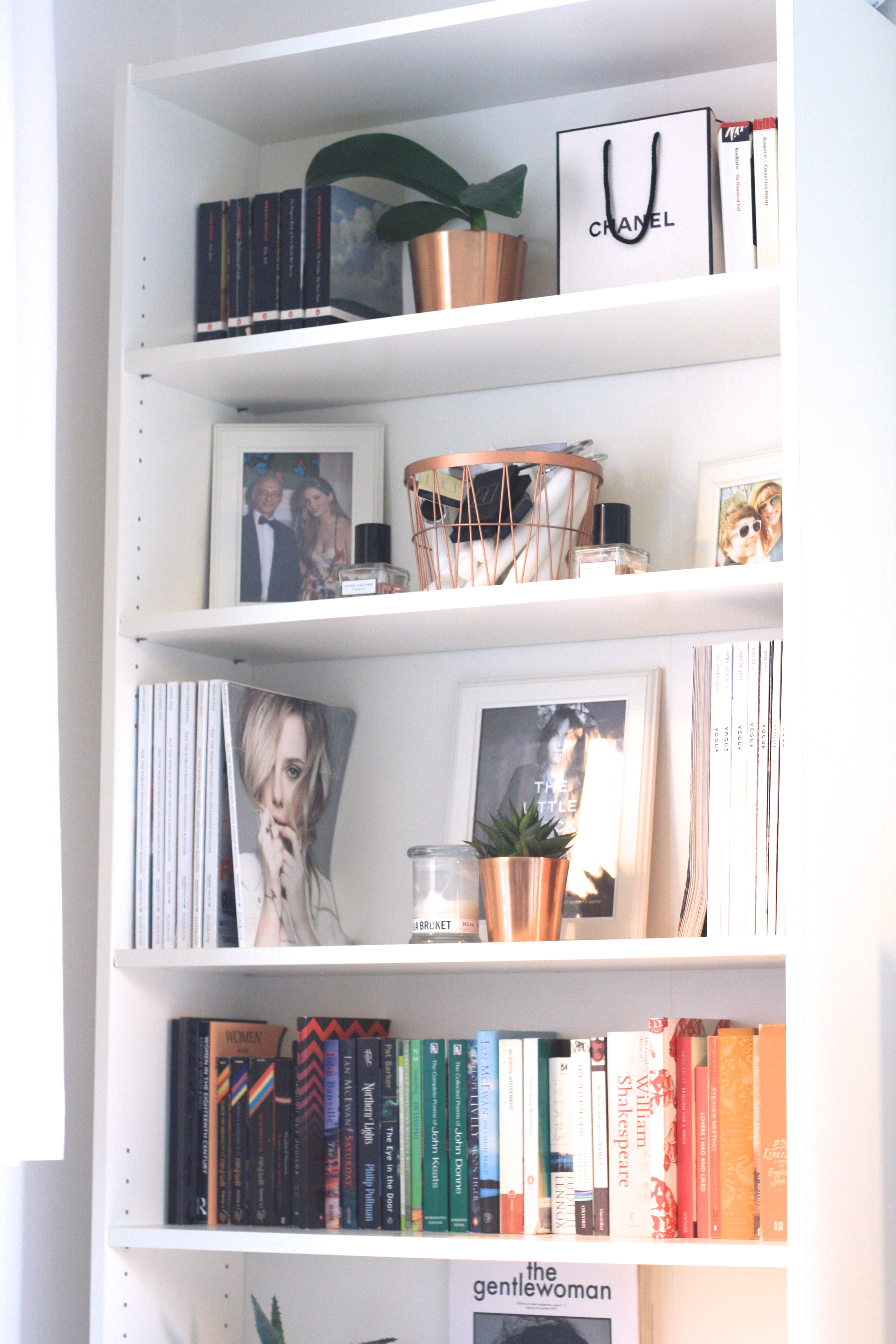
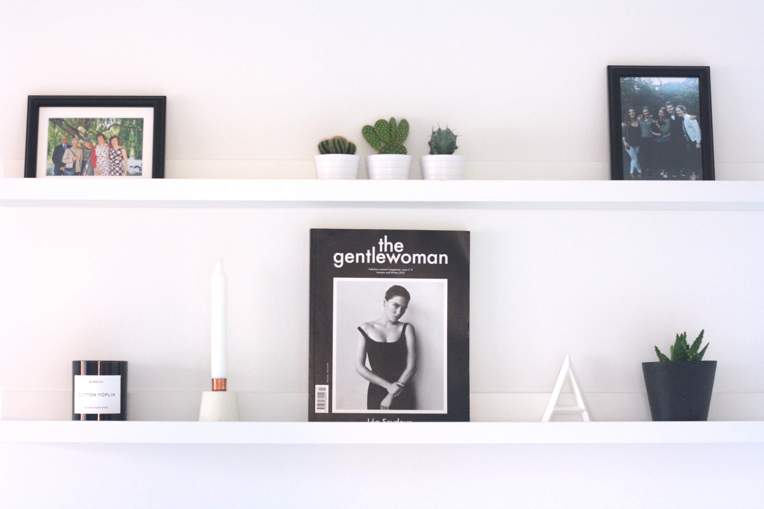
As you can tell, for my floating shelves (above) I've stuck to just black & white, which gives them a very smart, graphic feel. For my bookshelf (below) I've been more liberal with colour, but I've still arranged my books by colour, grouping together white and black tomes by the same publisher on the top shelf, and then colour-coding all the others on the smaller shelf below. This gives some order to my otherwise random collection of titles. The copper accents throughout the bookshelf help tie all the shelves together to a common theme.
2. Symmetry is key
My favourite shelf is the one with the Alexa Chung picture in the centre (just the framed back page of a magazine) with a stack of Vogues on one side and ELLEs on the other: the eye is drawn to the central picture by the matching magazines. Likewise the items on my floating shelves: the Gentlewoman is the focal point of the lower shelf amidst corresponding white then black objects.
3. Vary your heights
I like how I have a tall shelf for my magazines with a smaller shelve for books underneath it, as it adds interest (most bookshelves allow you to move your shelves around pretty easily). Similarly, I contrasted the tall Gentlewoman cover on the bottom of my two floating shelves with a trio of mini catci above it; a tall photograph above it would have looked unbalanced.
4. Start with a couple of items you love and build around them
For me it was the black & white Gentlewoman issue, the copper basket and the Alexa Chung picture. I've made these focal points and added other complementary objects around them.
5. Everything looks better with plants
If in doubt, add succulents in copper or concrete pots: the greenery somehow makes everything look much more welcoming and homely, without compromising on minimalism.
If you're still stuck for ideas, I've suggested some items to start you off below.
If you're still stuck for ideas, I've suggested some items to start you off below.

---- shop the post ----


No comments
Post a Comment